Chapter 51 — Characteristics of Countries at Different Levels of Development
Cambridge International AS & A Level Economics (9708) · Unit 11.4 · 4th edition coursebook
Learning objectives
- Explain how the birth rate, death rate, infant mortality and net migration are measured.
- Analyse the causes of changes in birth rate, death rate, infant mortality and net migration.
- Explain the concept of the optimum population.
- Explain how the level of urbanisation changes as countries develop.
- Explain how income distribution can be measured.
- Calculate and interpret the Gini coefficient.
- Analyse and draw Lorenz curves.
- Explain employment composition, in terms of primary, secondary and tertiary sectors.
- Analyse the pattern of trade at different levels of development.
Key terms
- demographers
- People who study changes in the structure of human populations.
- birth rate
- The number of live births per thousand of the population in one year.
- death rate
- The number of deaths per thousand of the population in one year.
- infant mortality rate
- The number of deaths of children aged under one per thousand live births in one year.
- net migration
- The difference between immigration and emigration.
- natural increase in population
- The number of live births exceeding the number of deaths.
- positive net migration
- More people coming to live in the country than people leaving the country to live elsewhere. It can also be referred to as net immigration.
- net migration rate
- The number of migrants per thousand of the population in one year.
- dependency ratio
- The proportion of the economically inactive compared to the labour force.
- optimum population
- The size of population that maximises GDP per head.
- Lorenz curve
- A diagram illustrating the extent of income or wealth inequality.
- primary sector
- Industries involved in farming and extracting natural resources.
- secondary sector
- Industries that manufacture products.
- tertiary sector
- Industries that produce services.
51.1Population growth and structure
Government statisticians and demographers measure how populations have changed and predict how they will change. The four central measures are the birth rate, the death rate, the infant mortality rate and net migration.
Measuring population change
The birth rate is the number of live births per thousand of the population in one year. It is calculated by dividing the total number of live births in a year by the size of the population and multiplying by 1000. The birth rate is sometimes called the crude birth rate because it gives only the headline number and does not, for example, break births down by the age of the mother.
The death rate is the number of deaths per thousand of the population in one year. It includes deaths of children aged under one, although countries also measure these separately as the infant mortality rate: deaths of children under one per thousand live births. When the birth rate exceeds the death rate, the country experiences a natural increase in population.
A country's population is also influenced by external migration - flows of people into and out of the country. Net migration is the difference between immigration and emigration. Positive net migration (or net immigration) occurs when more people arrive than leave. The net migration rate is the number of net migrants per thousand of the population in a year, calculated by dividing net migration by total population and multiplying by 1000.
Watch the language carefully. The birth rate is the number of births per thousand of the population, while the fertility rate is the average number of children a woman will give birth to over her lifetime. The two move together but are not the same.
Key concept link - Progress and development
A key indicator of a country's progress and development is an increase in the life expectancy of its residents. Such an increase can be the result of improvements in education, healthcare, housing and nutrition.
Causes of changes in population
As countries develop, the growth of their populations tends to slow. Both the death rate and the birth rate fall, but the birth rate usually falls faster. Better healthcare, education, sanitation, housing and nutrition help people live longer, which reduces the death rate. A declining infant mortality rate, the rising direct and opportunity cost of bringing up children, and rising participation of women in the labour force all reduce the birth rate.
Some highly developed economies experience a natural decrease in population - more deaths than births - but still see overall population growth because they attract net immigration. People may want to move to such a country to gain higher income and a higher standard of living.
Low development is often associated with high rates of population growth, mainly because the birth rate exceeds the death rate by a wide margin. The birth rate tends to be high in low-development economies for several connected reasons:
- Children are needed to support their parents in old age;
- Methods of birth control may be hard to obtain;
- The relative cost of raising children is lower;
- Women may have low levels of education;
- High infant mortality encourages families to have more children, expecting that some will not survive.
The result is a young population with a high dependency ratio - a small working population that has to produce enough goods and services to sustain not only itself but also a large number of children who are economically dependent on it.
As income per head, education and healthcare rise, the death rate initially falls more rapidly than the birth rate, so population growth accelerates. The birth rate then begins to fall faster than the death rate, and growth slows. High development does not eliminate population problems - it brings new ones. The most common is an ageing population: a low birth rate combined with a low death rate raises the average age. Dependency ratios are again high, this time because a large elderly population is reliant on a smaller working-age group. With people living longer, healthcare and pension costs rise; to contain pension costs, many developed-country governments have raised the retirement age.
Key concept link - The margin and decision-making
Economic influences play a role in families deciding whether to have children or not. These influences include the cost of educating children and income that may be lost when raising children.
The optimum population (see Figure 51.6)
To assess the effects of differences in population size, economists use the concept of the optimum population. The optimum population is said to exist when output per head is the greatest, given the existing stock of the other factors of production and the current state of technical knowledge.
The relationship can be shown on a diagram with population size on the horizontal axis and output per head on the vertical axis. The curve rises from low population levels, reaches a maximum at the optimum population (call it P1), and then falls. As population grows from a low base, it can make better use of the existing stock of land and capital, so increasing returns are enjoyed and output per head rises. Beyond P1, additional workers add less and less to total output, decreasing returns set in, and output per head falls. If the stock of capital rises or technology advances, the whole curve shifts upwards and the optimum population shifts to a higher level (say P2) with a higher peak output per head.
If a country's actual population is below the optimum, the country is described as underpopulated. If it is beyond the optimum and decreasing returns are being experienced, the country is overpopulated. In practice the situation is dynamic: the state of technical knowledge is constantly improving and the quantities of other factors are continuously changing, so the optimum population for a country is not fixed. The criteria are also purely economic and may be disputed - for example by conservationists, who may put greater weight on environmental capacity than on output per head.
Population growth is not the same as population size. Low-income countries tend to have high population growth rates, but not necessarily large population sizes: a country can have a very high growth rate and still have a relatively small absolute population.
Level of urbanisation
Countries with low income per head tend to have a relatively high proportion of their population living in rural areas and rapid rates of rural-urban migration. The combination puts pressure on urban infrastructure, housing and schools: the existing urban areas struggle to absorb the inflow of new residents at the pace at which they arrive.
Most high-income countries already have the majority of the population living in urban areas, so urban populations grow slowly. In some cases the flow has begun to reverse: advances in technology, especially in communications, allow more people to work from home, and some households are moving from urban to rural areas.
The urbanisation gap is one of the clearest structural differences between low-development and high-development economies. It also has knock-on effects for the kind of jobs people do and the way services - healthcare, education, transport - have to be provided.
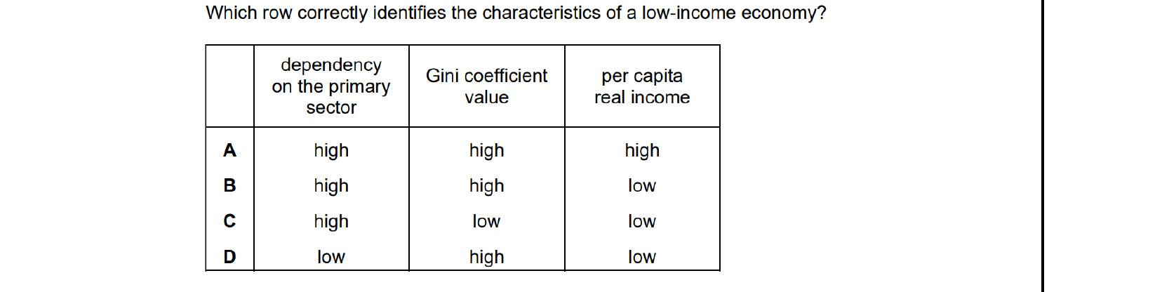
Low-income economies depend heavily on the primary sector (agriculture, mining), have wide inequality (a high Gini coefficient) and low real income per capita. Row B matches this profile: high primary-sector dependence, high Gini, low per-capita real income. The other rows mix in features (low primary dependence, low Gini, high incomes) typical of developed economies.
51.2Income distribution
Income is unevenly distributed in many countries, partly because income-generating assets — especially land — are concentrated in the hands of a few. The two main tools economists use to measure and visualise income inequality are the Gini coefficient and the Lorenz curve.
The Lorenz curve (see Figure 51.7)
A Lorenz curve plots the cumulative percentage of population (from poorest to richest) on the horizontal axis and the cumulative percentage of income (or wealth) on the vertical axis. A 45° diagonal — the line of equality — corresponds to perfect equality: the poorest 20% earn 20% of total income, the poorest 40% earn 40%, and so on. The actual distribution is plotted as a curve that lies below the line of equality. The further the curve sags away from the diagonal, the more unequal the distribution.
The cumulative percentages are built up by adding the income shares of successive quintiles (or any chosen population groupings). The cumulative share at the right-hand edge of the chart is always 100% because the whole population earns the whole national income. The points trace out the Lorenz curve. The more income is concentrated in the higher-income groups, the more the curve sags below the line of equality.
The Gini coefficient
The Gini coefficient is a single number summarising the inequality shown by the Lorenz curve. On the Lorenz diagram, let area A be the area between the line of equality and the actual Lorenz curve, and let area B be the area below the Lorenz curve. The Gini coefficient is then calculated as A / (A + B). The area below the line of equality is 50% of the total chart area. A Gini coefficient of 0 means perfect equality (the Lorenz curve coincides with the line of equality, so A = 0). A coefficient of 1 means complete inequality (one person earns everything). Neither extreme occurs in practice, so the Gini lies between 0 and 1 — the higher the figure, the more unequal the distribution. The Gini coefficient multiplied by 100 is sometimes called the Gini Index.
Key concept link — The role of government and the issues of equality and equity
A more even distribution of income is often the result of government intervention undertaken to promote greater equity.
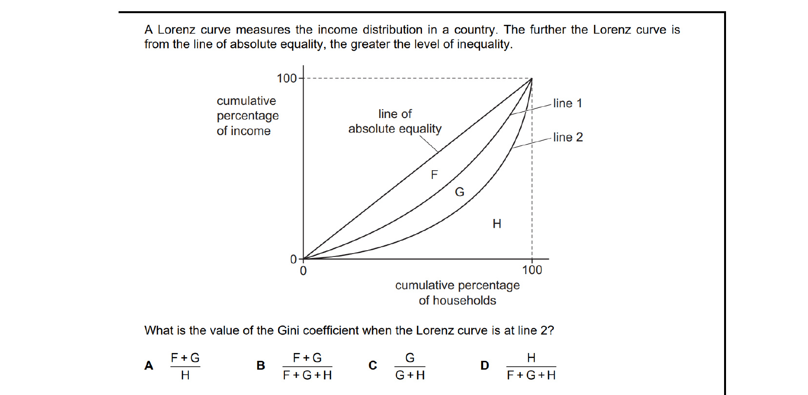
The Gini coefficient is the area between the line of perfect equality and the Lorenz curve, divided by the total area beneath the line of perfect equality. With the curve at line 2, the area enclosed between the equality line and line 2 is G, while the total area under the equality line is G + H. So the Gini coefficient equals G / (G + H).
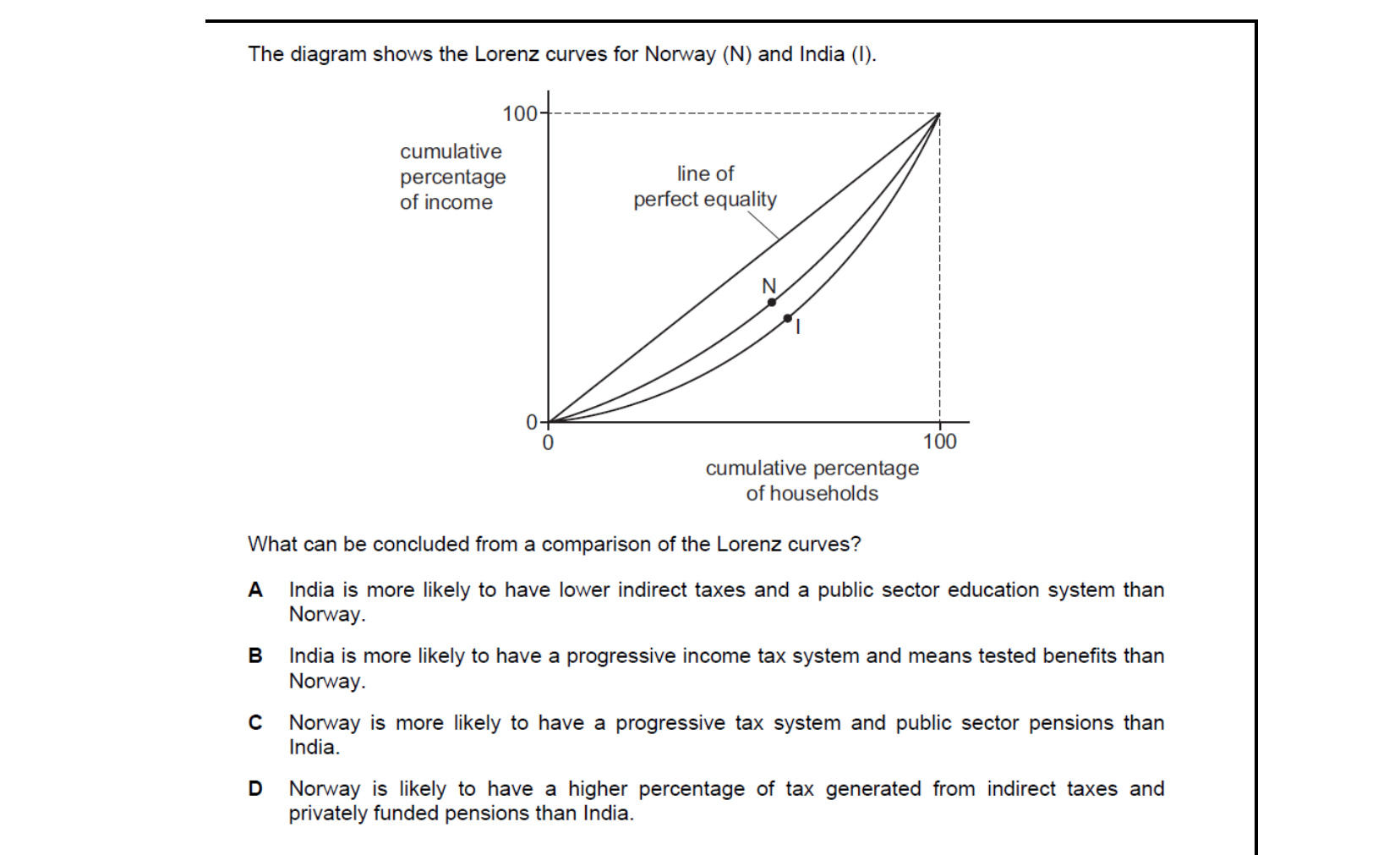
Norway's Lorenz curve sits closer to the line of perfect equality than India's, reflecting much lower income inequality. Achieving that requires a progressive tax system (high earners taxed more heavily) and broad public provision such as state-funded pensions. Hence Norway is more likely than India to have a progressive tax system and public sector pensions.
51.3Economic structure
Employment in different sectors of the economy
The structure of employment shifts as economies develop. Countries with high income per head and high development typically have most of their labour force in the tertiary sector. Countries with low income per head and lower development are typically more dependent on the primary sector. A heavy dependence on agriculture leaves these economies vulnerable to the forces of nature: a drought in a subsistence economy can quickly produce famine, and in an economy that depends on agricultural exports a drought can wipe out foreign currency earnings.
As an economy develops, the share of the primary sector in employment and GDP tends to decline. The secondary sector — manufacturing and construction — becomes the major source of employment, and as the economy develops further the tertiary sector takes the lead. In some cases, employment moves more from primary to tertiary than to secondary — for example where tourism expands. The total value of primary-sector output can also rise even as the labour share shrinks, given higher labour and capital productivity. The three sectors are: the primary sector (agriculture and the extractive industries such as oil extraction and mining); the secondary sector (manufacturing and construction); and the tertiary sector (service industries such as banking, education, healthcare and tourism).
Pattern of trade at different levels of development
Many economies with low development and low income per head depend on primary products for most of their export revenue. This leaves them exposed in trading relations because both demand and supply can change sharply: demand may fall because of a health scare, and supply may rise because of a good harvest. Prices of primary products therefore fluctuate frequently and by large amounts.
In addition, demand for many primary products — especially food — is income-inelastic. As world income rises, demand for primary products rises only slightly, while demand for manufactured goods (which is income-elastic) rises strongly. Over time this tends to make primary goods relatively cheaper than manufactured goods, and the terms of trade of primary-exporting countries tend to deteriorate: low and falling prices for what they sell, high and rising prices for what they buy.
Countries with high development and high income tend to export mainly manufactured goods and services and to export a wide range of products. Some low-income countries, in contrast, rely heavily on exporting a narrow range — making them vulnerable to changes in the price or demand for that narrow set of products.
End-of-chapter practice
Past-paper questions from CIE 9708. Pick A, B, C or D. Answers are saved on this device — press Download report (PDF) at the top to save them.
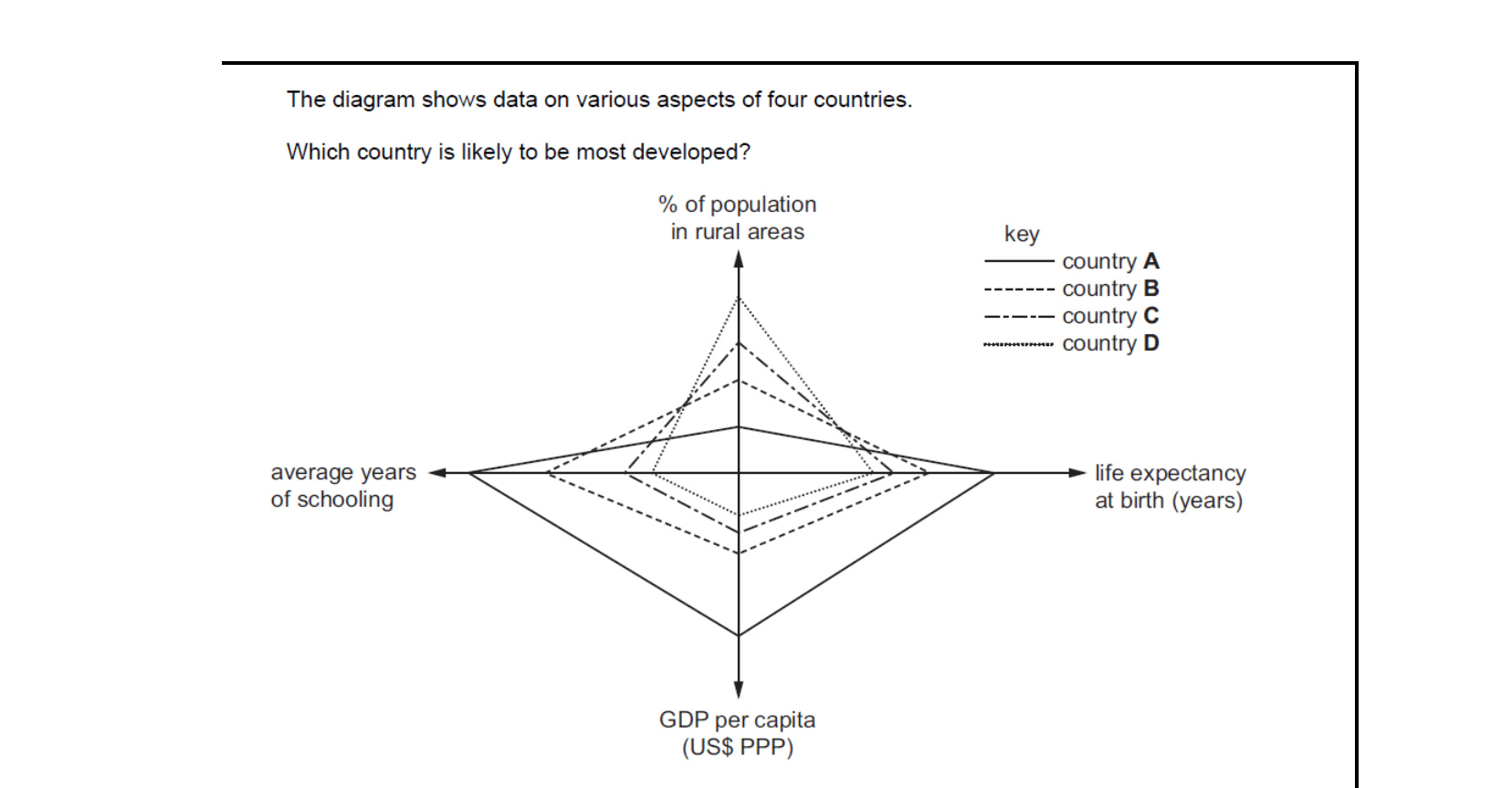
Development is reflected in higher GDP per head, longer life expectancy, more years of education and a smaller rural share. The country whose plot sits furthest out on income, life expectancy and schooling, and lowest on rural population, is country A — it scores best across every dimension, so it is most likely to be the most developed.
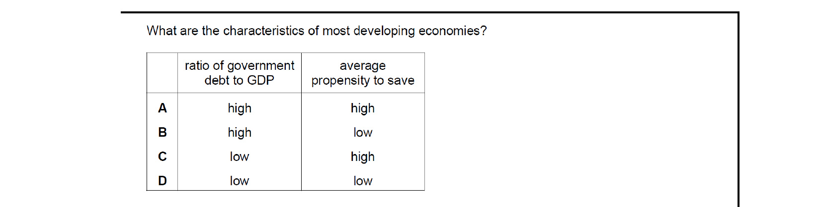
Developing economies typically face heavy external borrowing relative to GDP because of weak tax bases and large infrastructure needs — so debt-to-GDP is high. Yet incomes are low, so households spend most of their income on essentials and the propensity to save is low. Hence the typical pattern is high debt-to-GDP combined with a low saving propensity.
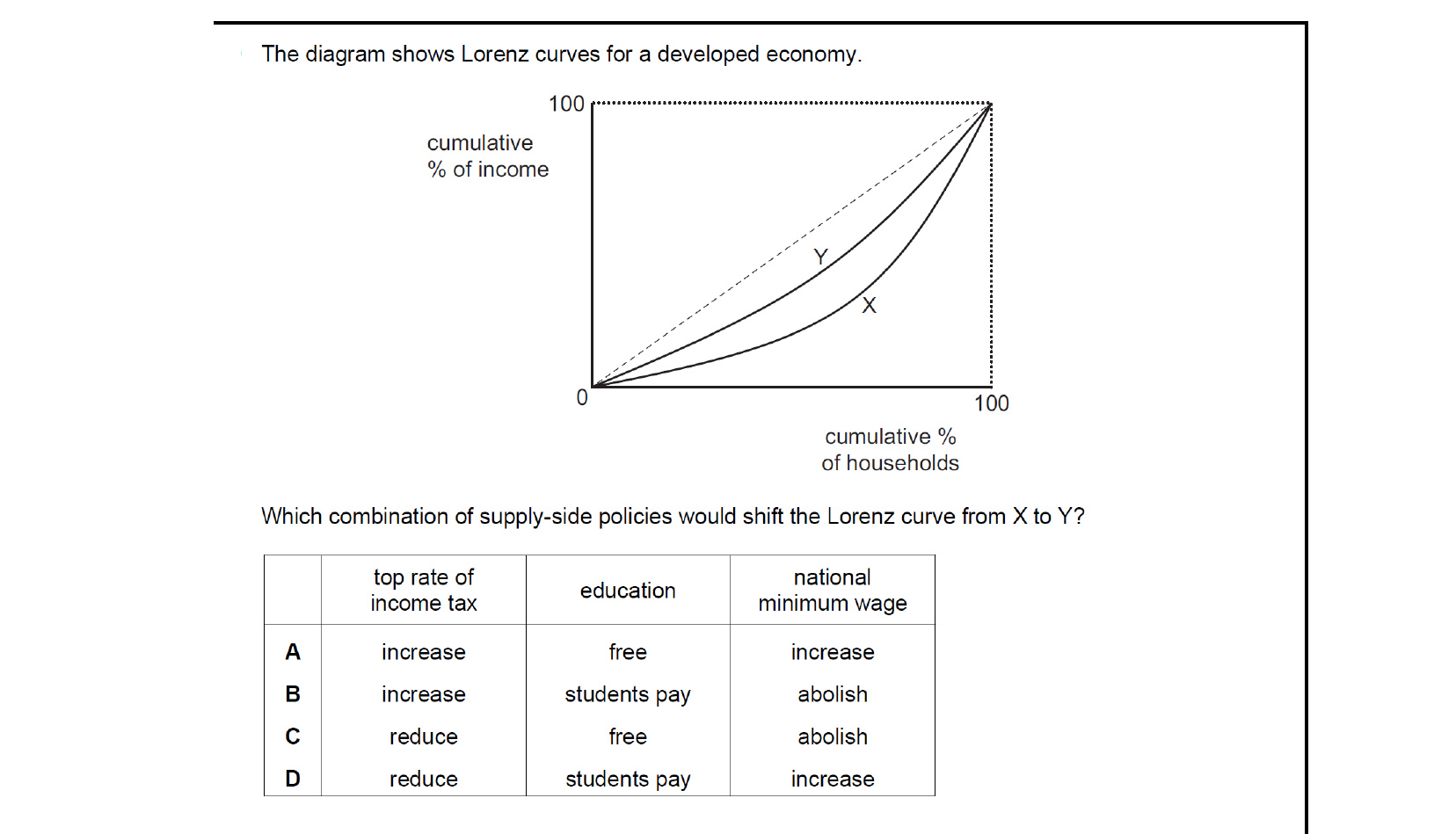
Moving from Lorenz curve X to Y (closer to the line of equality) means inequality has fallen. A higher top rate of income tax taxes the rich more; free education raises low-income groups' skills and earning power; and a higher national minimum wage lifts incomes at the bottom. Combination A — raise the top rate, free education, raise the minimum wage — does all three.
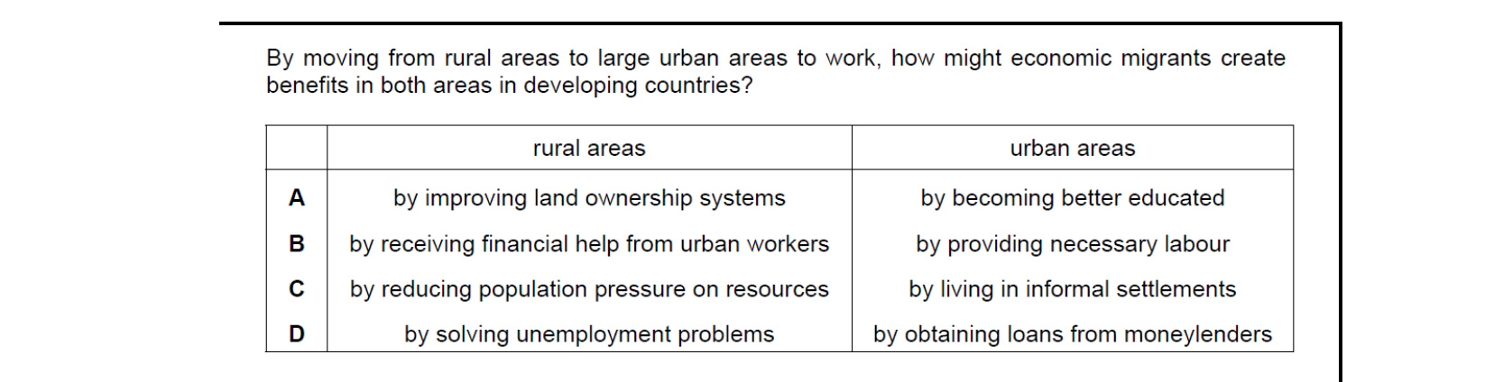
Migrants who move from rural areas to cities provide the labour that urban industries and services need to expand. They also earn cash incomes and send remittances home, providing financial help that supports their rural families. So the benefit to urban areas is supplying necessary labour, and the benefit to rural areas is the financial assistance received from urban workers.
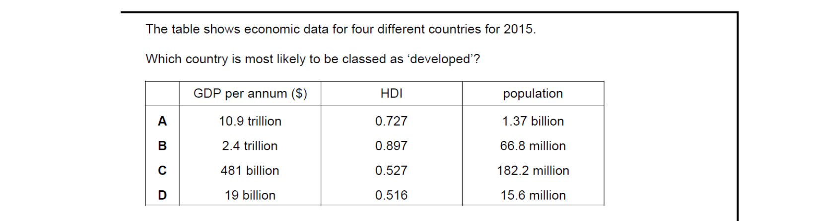
Among developed economies you expect high GDP plus a high HDI score, not just a big total economy. Country A has the largest GDP but only a middling HDI of 0.727 — its 1.37 billion population dilutes income per head. Country B's HDI of 0.897 (well above the 0.8 'very high development' threshold) on $2.4 trillion of GDP across 66.8 million people fits a developed economy.
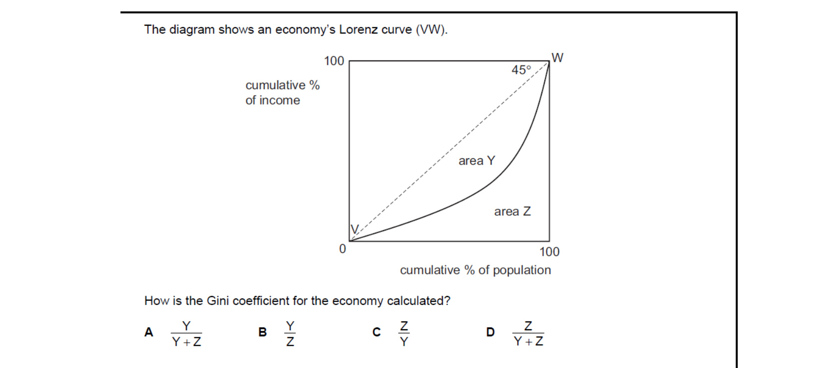
The Gini coefficient is the share of the triangle beneath the 45° line that lies between that line and the Lorenz curve. Area Y is the gap area (between perfect equality and the actual Lorenz curve VW), and Y + Z is the whole triangle under the 45° line. So the Gini coefficient equals Y / (Y + Z).

A basic state pension reduces households' need to save for old age, lowering the household saving ratio. It also weakens the traditional motive to have many children as future support — encouraging smaller family sizes, so the birth rate falls. Hence introducing a state pension is the single measure that pulls both variables down.
Attempt the practice questions above to build your score.
Self-evaluation checklist
After studying this chapter, you should be able to:
- Explain how the population growth and structure of a country may be measured by the birth rate, death rate, infant mortality rate, net migration.
- Analyse the causes of changes in population.
- Understand that optimum population is the population which gives the highest output per head.
- Recognise that levels of urbanisation tend to increase as an economy develops.
- Explain how income distribution can be measured.
- Calculate and interpret the Gini coefficient (a measurement of income distribution).
- Analyse and construct a Lorenz curve to show how income or wealth is distributed.
- Discuss how employment composition moves from the primary to the secondary to the tertiary sectors as an economy develops.
- Analyse the pattern of trade at different levels of development.
Want more practice? Drill this chapter's past-paper MCQs (55 questions) →